Kantiva Bioscience Branding and Packaging
The Problem: The previous Kantiva brand lacked consistency and was not a true reflection of Kantiva’s natural products and the contemporary nature of the company as a whole. The logo was outdated and was in need of a refresh.
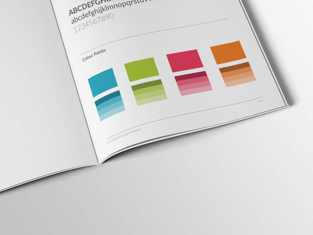
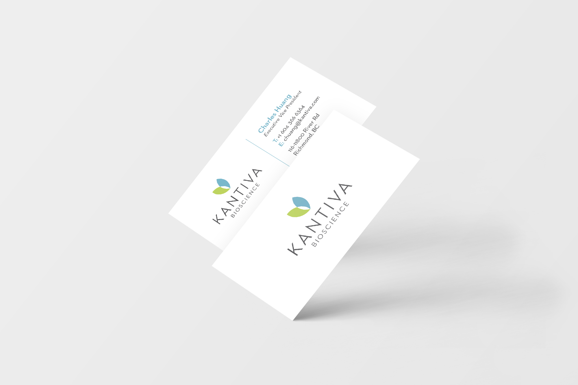
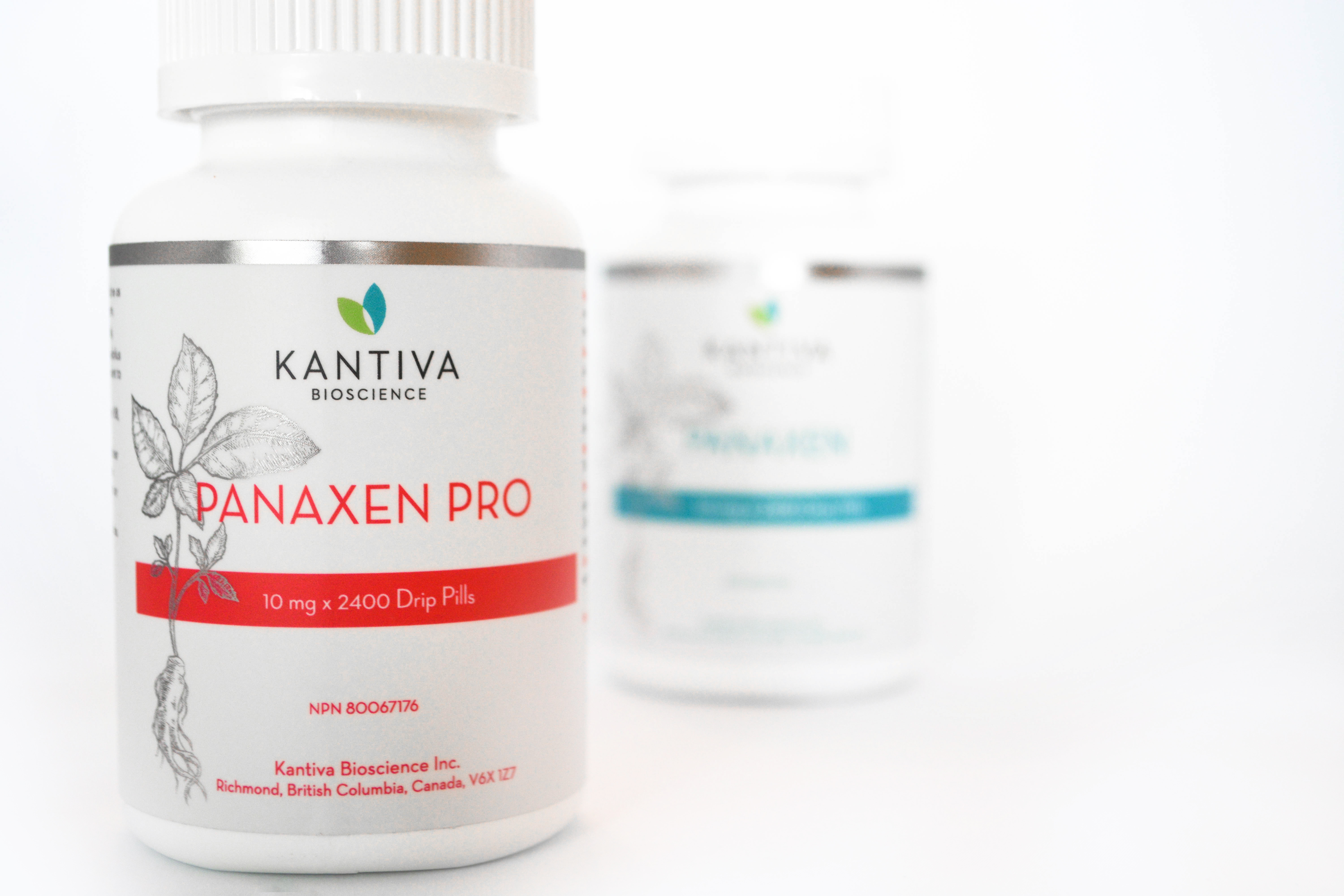
The Solution: The new Kantiva brand features design that combines modern, clean and elegant elements. This includes the use of minimalist sans serif typography, clean iconography and fresh, bright colours. The icon was developed from a symmetrical representation of a ginseng leaf (symbolic of the product’s ingredients) which was then stripped down to two leafs to represent a heart. This symbolizes health and well-being—qualities that are key to the Kantiva brand. The colours touch on elements of science and nature as well.