Choyo Chocolate Cup Packaging
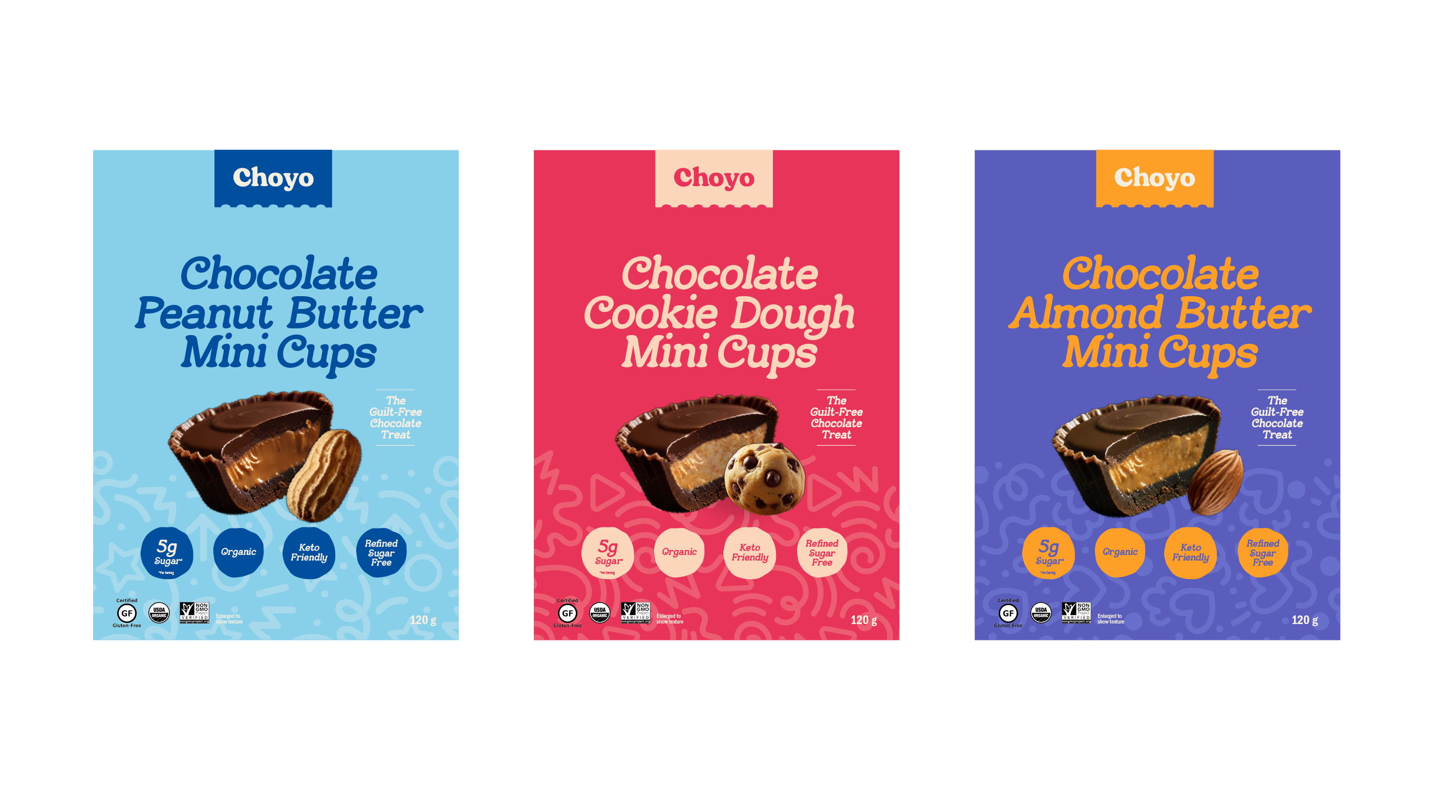
This conceptual project explores product variation within the food packaging industry, focusing on a line of chocolate cups. The objective was to create a cohesive visual identity across all three flavour profiles, while using playful and vibrant colour palettes to distinguish each product.
Each package features a bold composition, with large, enticing product imagery taking centre stage against rich colour blocks. Subtle background patterns add texture and depth without distracting from the main visuals. The product names are set in bold, curvaceous typography—striking a balance between whimsy and clarity—to enhance shelf appeal and brand recognition. The result is a lively, unified series that celebrates both flavour and visual delight.