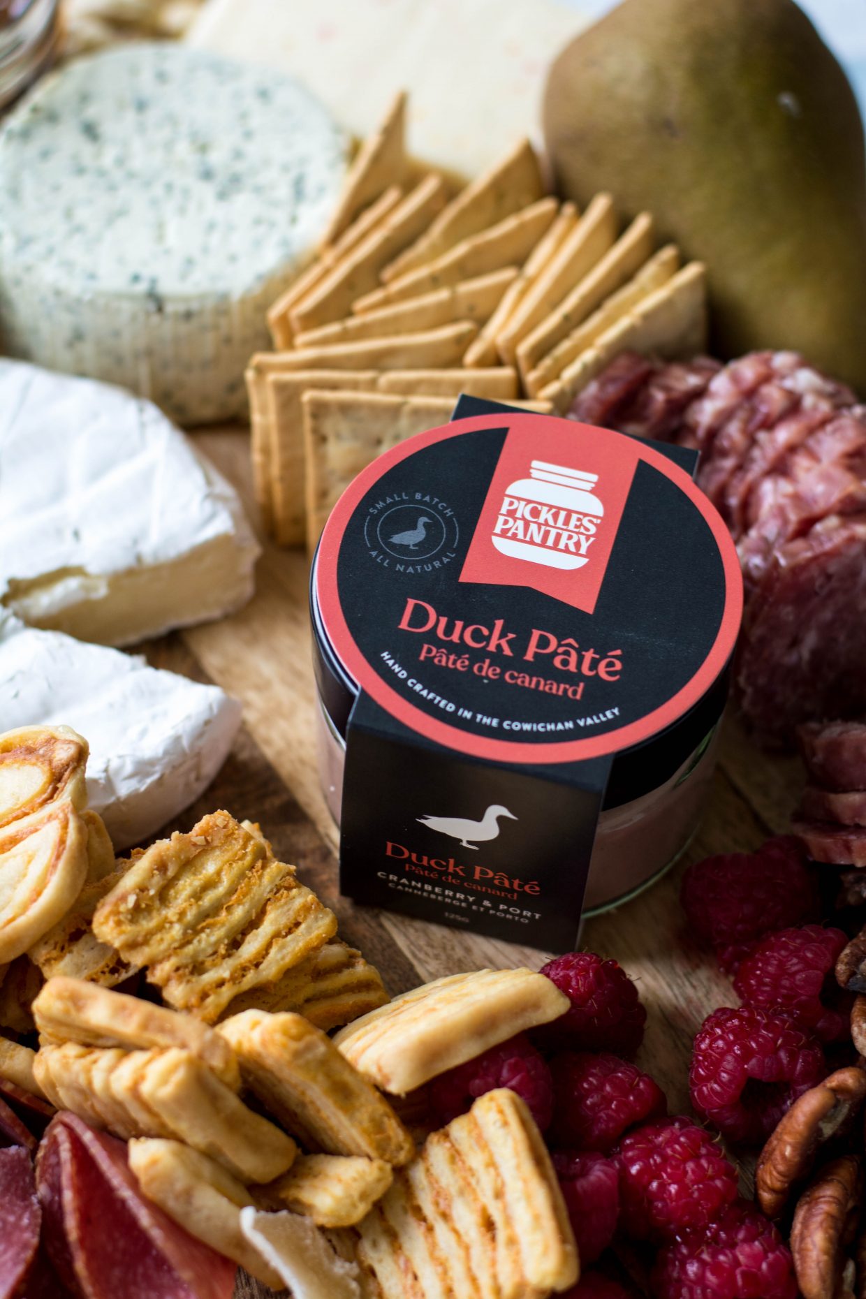
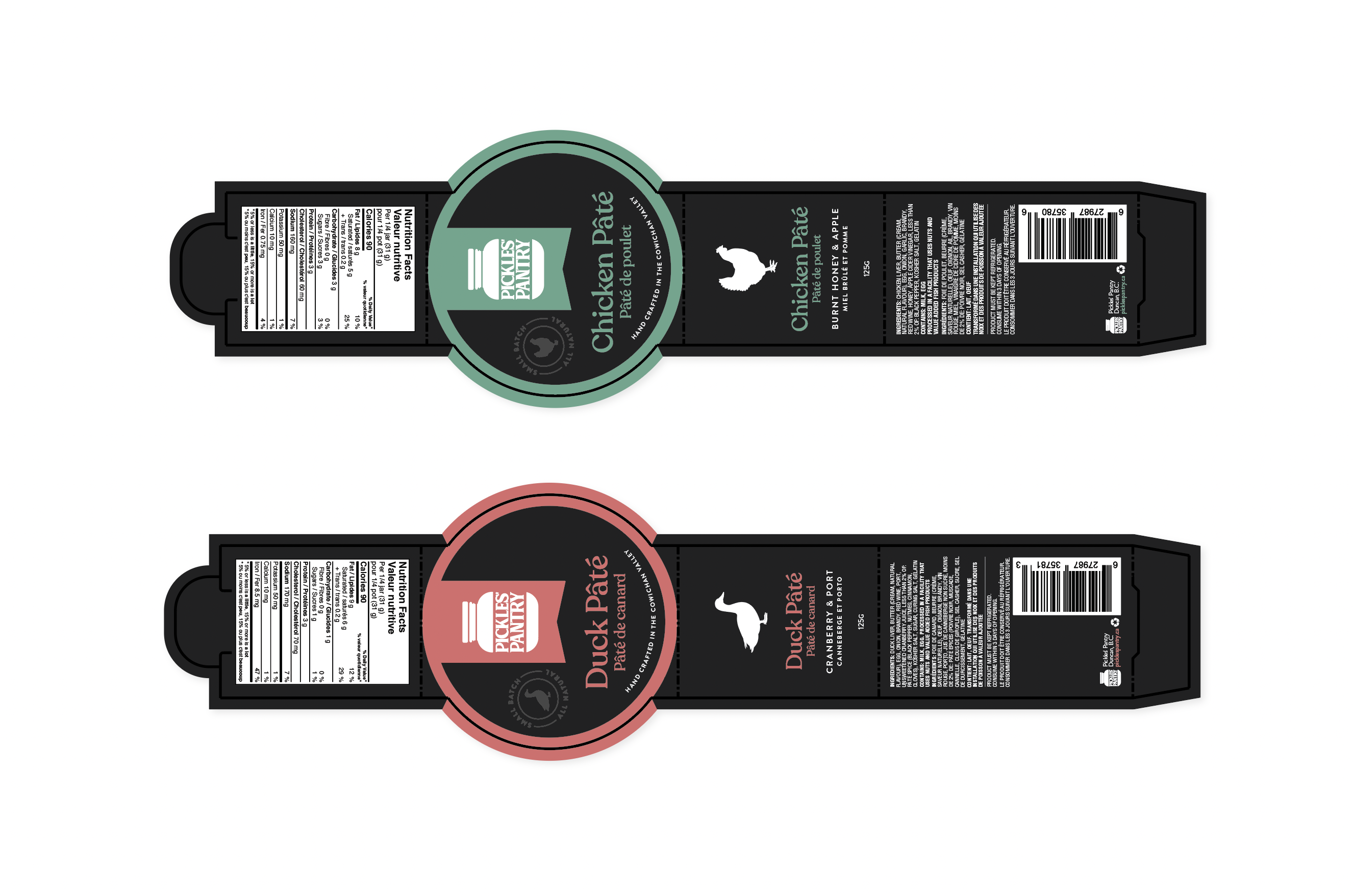
Pickles’ Pantry
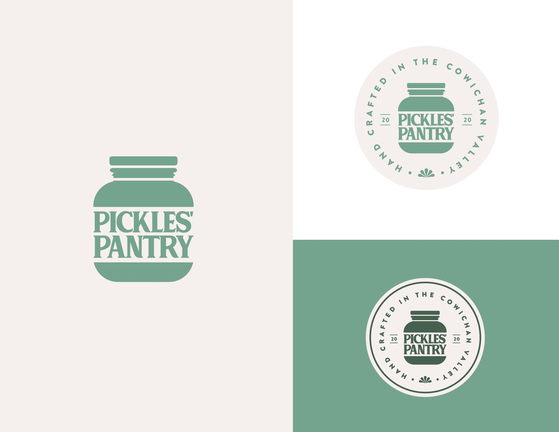
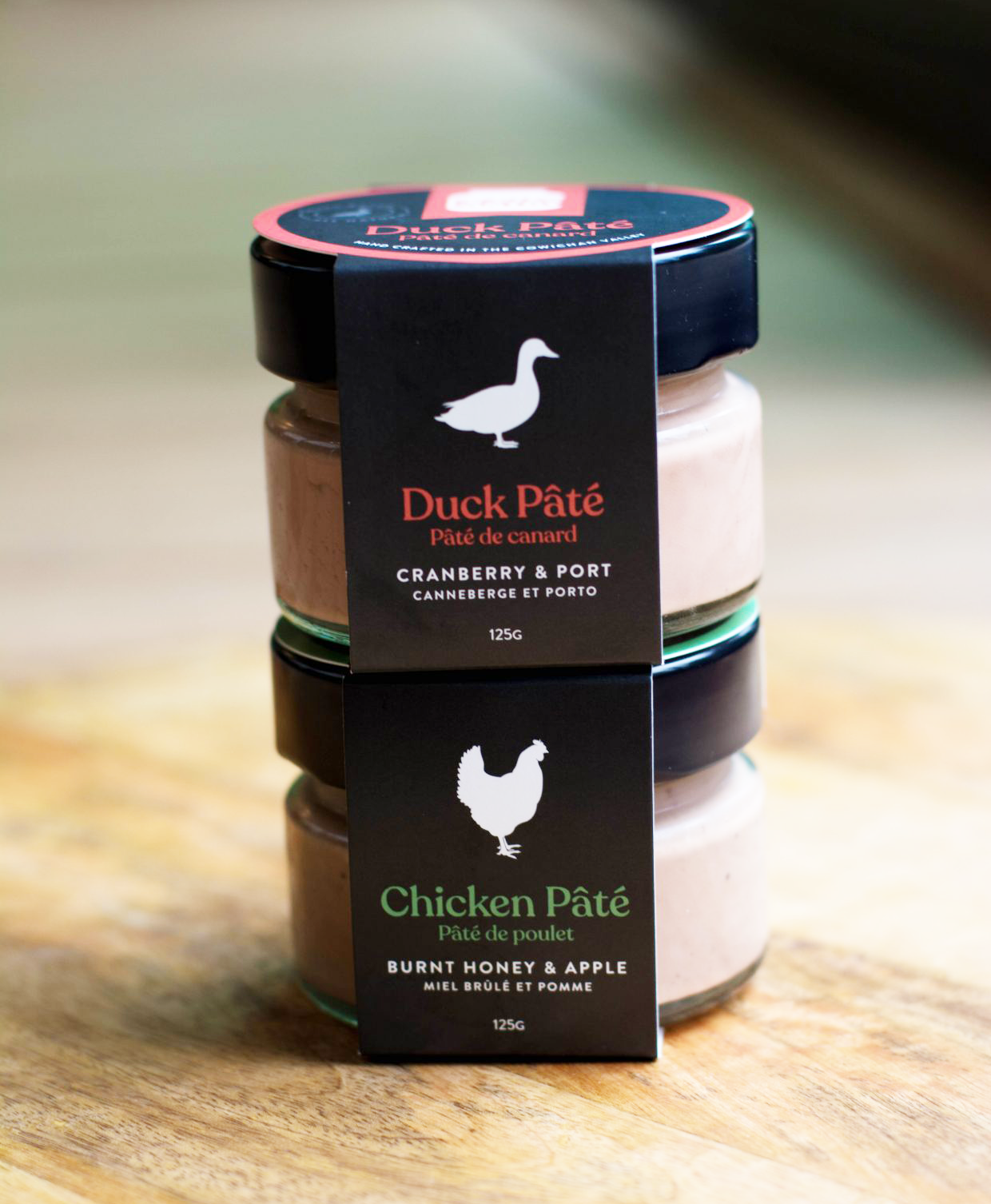
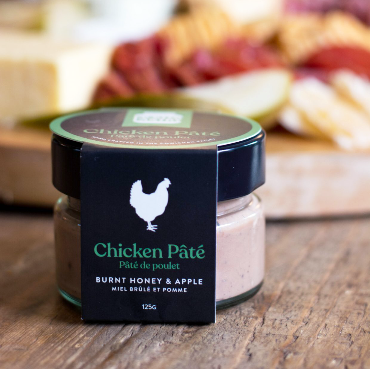
I was commissioned to design the logo and packaging for Pickles’ Pantry, a Vancouver Island–based artisanal charcuterie company specializing in small-batch pâté. The goal was to create a brand identity that felt bold and confident, yet warm and approachable—capturing the charm of the company’s name while maintaining a premium aesthetic.
Inspired by the “Pickles” in the name, I developed a visual concept centered around a classic pickle jar silhouette. This distinctive shape houses tall, bold serif typography, creating a playful yet structured visual hierarchy. For the labels, I chose a striking black background to convey sophistication, paired with crisp white chicken and duck silhouettes that clearly differentiate the two pâté varieties. Rounded, elegant typography softens the look, while vibrant pink and teal accent colours add personality and flavour distinction.
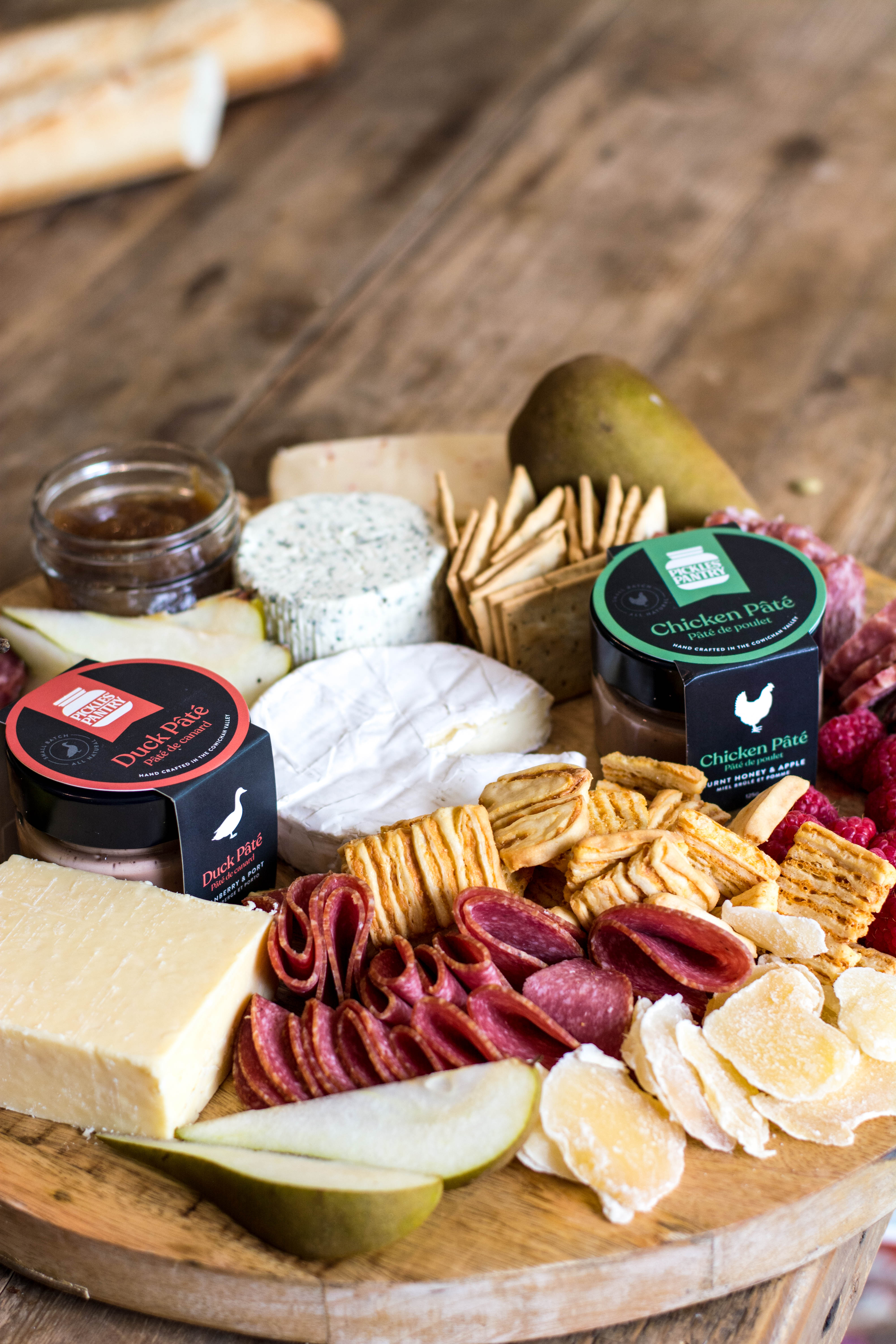
The final design is both eye-catching and memorable—helping the brand stand out on crowded shelves. The client credits this cohesive branding with drawing the attention of key grocery buyers and contributing significantly to the successful launch of the product line.